
Cross-Platform Redesign
Mobile App Design
CITYROW
Fitness
B2C

Team
1-PM, 1-Product Designer, 4+ Engineers, Chief Brand Officer
Role
Lead Product Designer
Responsibilities
UX/UI Design, Competitive Analysis, High-Fidelity Prototyping, Usability Testing
Challenge
In 2020, CITYROW, a boutique fitness studio, sought to enhance its digital experience with an immersive digital rowing machine and redesigned mobile app. The initiative aimed to integrate the app with the new rower, prioritizing a clean, user-friendly interface for an engaging experience. The challenge was a complete app overhaul, improving usability, visual appeal, and seamless integration with the rower. Additionally, the app needed to provide consistent support for users of both the rower and mobile interface, while simplifying the information. The goal was to create an immersive rowing experience without sacrificing essential features or usability.
Business Objectives
Launch the new digital rower and ensure seamless mobile app integration for a smooth user experience.
Increase user engagement by prioritizing rowing-specific classes and deprioritizing non-rowing formats.
Simplify the app interface to focus on essential features, creating an intuitive experience for the target user base.
User Needs
A larger selection of rowing-specific classes and focused workouts.
Simplified, clutter-free experience with rowing as the main exercise.
Easy access to class schedules, equipment filters, and personalized features like workout tracking and progress.
Ideation & Concept Development
Brainstorming
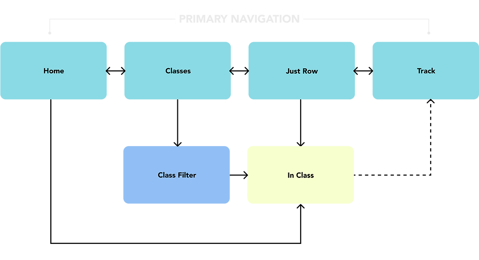
I began by analyzing the existing app’s user flows and interface, identifying key pain points. Collaborating with the product and engineering teams, I refined the design direction with a focus on integrating the digital rower's large screen breakpoint, simplifying class offerings to emphasize rowing-only sessions, and streamlining UI elements for a cleaner, more intuitive experience across all mobile experiences.
Wireframing
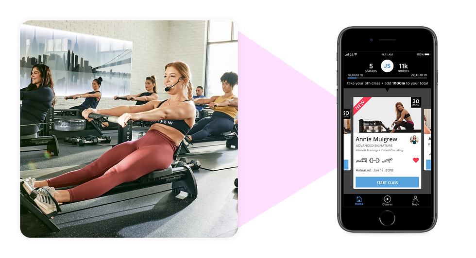
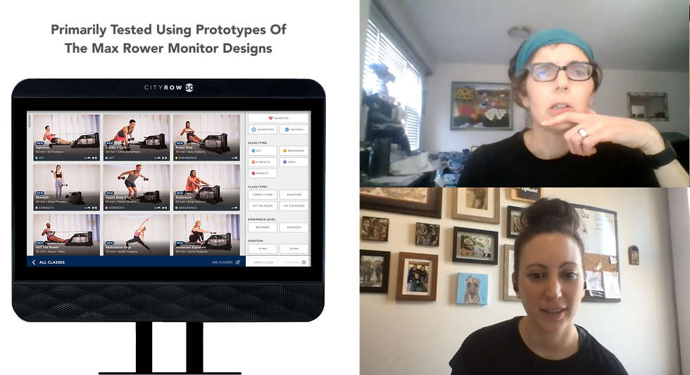
I designed early wireframes for key app sections, including a class filter for easy categorization. This filter would allow users to find rowing-only classes by duration, intensity, or equipment. The class detail page focused on extensive but essential information such as class type, duration, required equipment, and an engaging call-to-action to join or save.
Research & Discovery

user research
To understand user pain points and preferences, I conducted surveys and interviews. Survey results showed most users were middle-aged women (35-65), discovering the app via WaterRower, CITYROW studios, and online search. Users (mostly at-home rowers) preferred rowing-only classes, shorter workouts (20-30 minutes), and clearer equipment details.

competitive Analysis
I researched other fitness apps such as Peloton, Ergatta, and Nike Training Club to carefully examined their user interfaces, class offerings, and how they integrated hardware with the app experience. This analysis helped identify key opportunities for differentiation, enabling me to prioritize simplicity, intuitive design, and rowing-centric features that would enhance the user experience.

key insights
Users expressed a desire for greater clarity regarding the class structure, equipment requirements, and workout goals. They preferred shorter, more focused rowing classes that targeted specific fitness outcomes. Additionally, the app’s aesthetic had to closely align with the in-studio brand experience, incorporating consistent typography, color palette, and clean design principles to ensure a seamless, cohesive experience across all platforms.
Design Approach
I focused on a scalable layout, highlighting class information, personalized rowing data, and calls to action to foster retention for each new user. I created interactive elements for filtering classes by type, duration, and required equipment, ensuring users could quickly find relevant content. Class detail pages were designed to provide an easy-to-read overview of the class type, duration, and equipment required before user committed to starting a new class.
To reinforce brand identity, I used consistent elements like bold typography and muted colors to mirror the in-studio experience. I incorporated subtle microinteractions and animations, such as buttons and progress bars, to enhance user engagement without overwhelming information. The navigation was simplified by reducing the number of screens and focusing on core features, ensuring high contrast and readability for accessibility. The design also emphasized inclusive principles, with large touch targets for mobile devices to improve usability while seated on a rowing machine.
Design Principals
Prioritize minimalism to reduce cognitive load and ensure easy access to information.
Maintaine brand consistency by reflecting the in-studio experience with familiar elements.
Focuse on user-centered design to meet the needs of at-home rowers, providing a functional and enjoyable workout experience.
Iterative Process
I created multiple iterations of the primary screens incorporating feedback from stakeholders and in-studio as well as app users. Design changes focused on enhancing accessibility and refining information architecture for improved ease of use.

impact
Increased engagement in rowing-specific classes, which aligned with the core user preference.
Improved app satisfaction and retention rates due to a more intuitive design and clearer user flows.
Successful product launch of the digital rower with a cohesive mobile app experience that mirrored the in-studio feel.
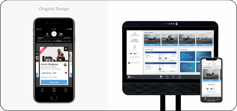
The end Product
Final Solution
A redesigned app with a clean, user-focused layout highlighting essential features for rowing enthusiasts.
Integration with the digital rower to track workout data directly through the app.
An intuitive class filter system and detailed pages with clear class information, helping users make informed decisions.
Usability Testing & Validation
Usability Testing
I conducted remote usability testing with current users, finding they appreciated the simplified navigation, clear class categorization, and effective filtering system. Rowing-only classes resonated with the target demographic. Feedback sessions with stakeholders refined features, including layout changes and filter options.
Success Metrics
Users reported increased satisfaction with the improved class filter functionality and seamless integration of the rower. Testing revealed higher engagement, particularly with users filtering for rowing-only classes and shorter durations, aligning with their preferences. Survey findings further validated this, as users demonstrated a clear preference for simplified class categories and focused workout durations.
Conclusion
The CITYROW Cross-Platform Redesign successfully launched a cohesive app experience that prioritized user needs, simplified navigation, and aligned with the brand’s vision. The project delivered a seamless integration with the digital rower, driving increased engagement and satisfaction.
Close collaboration with the Chief Brand Officer ensured the design was aligned with the brand’s aesthetic and user goals. The iterative testing process helped refine the design to meet user expectations, especially regarding navigation and content clarity.
Balancing the integration of new hardware while maintaining simplicity.
Focused, user-centered design is critical for complex integrations. Continuous stakeholder alignment ensures a cohesive final product.
Expand class offerings and personalization features to increase long-term engagement. Explore deeper integrations with wearable devices for enhanced tracking.

"I absolutely love the redesigned CITYROW GO app! The clean, minimalist layout makes it so easy to navigate, and the seamless integration with my rower is a game-changer. I can easily filter for rowing-specific workouts, and the class details are clear and helpful. The whole experience feels so much smoother and more enjoyable!"